Showing posts with label web accessibility. Show all posts

Saturday, August 16, 2014

The Anchor Button: Bad for Accessibility, Bad for Usability

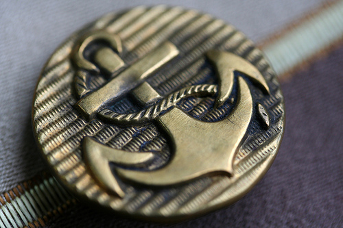
<a href="#">I'm a button, click me</a> — this is the anchor button. Designers and developers have been creating buttons interchangeably with the <div>, <span>, and <a> elements instead of button and input. Who cares—on the surface things look great, right? Well, the easy answer is, wrong—incorrectly using HTML elements is a bad thing, and usually creates additional work to then add the expected default behaviors of the correct elements.

I'll first explain what the spec says about these elements and then I'll explain why following it is important and easy—the HTML 5 specification is actually not that difficult to understand, especially regarding these elements.

The DIV and SPAN

You've probably seen HTML markup that looks like a sea of <div> elements. Here's what the spec says about the <div>:
…The <div> element has no special meaning at all…authors are strongly encouraged to view the <div> element as an element of last resort…use of more appropriate elements…leads to better accessibility for readers and easier maintainability for authors.
The <span> element should be treated with similar consideration:
The <span> element doesn't mean anything on its own…

The Anchor

It's not uncommon to see anchors used like this <a href="#">I'm a button, click me<a/> with some corresponding javascript that will get triggered when the link is clicked. According to the specification, the <a> element should be used as follows:
If the <a> element has no href attribute, then the element represents a placeholder...if [it] has an href attribute, then it represents a hyperlink...[hyperlinks] are links to other resources...

Bad Semantics is Bad for Accessibility and Usability

Buttons and anchors have expected behaviors and states. When you use the wrong elements, these will not be present unless additional work is done to add them.
tab order
<div> and <span> elements are NOT by default in the tab order; button and input are. <a> elements without an href attribute are also NOT in the tab order. Elements typically not in the tab order can be added by setting the tabindex attribute to 0 on that element.
hover and focus states
<div> and <span> elements do NOT by default have a hover and focus state (note: some browsers do provide a default focus state for all elements); button and input do. You can add these states via CSS using :focus and :hover.
click and keypress
Unlike button and input elements, <div> and <span> do NOT by default trigger the associated click event on keypress of both the ENTER and SPACE keys. Additional work will also be required for an <a> element to trigger the click event on keypress of the SPACE key.
assistive technologies
Buttons—or anything else–marked up with a <div> or <span> appear only as plain text to assistive technologies. Also, while <a> elements are treated uniquely, it's common to identify all links on a page using assistive technologies to more easily navigate throughout a site. Therefore, it might be strange having those intended to be used as a button to be mixed up with the other actual links. Any element intended to be a button not marked up using button or input can have the ARIA role attribute set to button—keep in mind, though, all the behaviors/states above still need to be implemented.
Check out this Pen on CodePen to further understand the behaviors/states above. I've also created the a11yButton jQuery plugin that will add the behaviors above to non-button elements.

If it Looks Like a Duck and Quacks Like a Duck...

The simplest rule of thumb is to just use the right HTML elements for the content. Realistically, this is not possible 100% of the time—just remember, when using the wrong elements keep in mind there are behaviors and states that may be expected that will need to be accounted for.

Tuesday, May 27, 2014

One of Many Reasons WAI-ARIA Is Awesome...More Semantics

Accessible Rich Internet Applications (WAI-ARIA) is now a W3C recommendation, so it's important web developers start to understand what it is and how to use it. Also, there's something awesome about WAI-ARIA. Not only does it benefit people using your site, it benefits you as a developer—it provides you with an arsenal of semantic attributes you can target in your CSS and javascript.

WAI-ARIA in a Nutshell

Assistive technologies rely on and take advantage of HTML built using semantic elements appropriate for the content, like nav, header, main, button, ul, and dl—they provide people dependent on assistive technologies the best possible experience. However, even the best markup can't always adequately describe the content and/or its state on a web page. WAI-ARIA allows you to add more meaning to existing HTML markup with roles and their supporting states and properties—there are over 100 combined, including:
  • tree
  • banner
  • group
  • aria-live
  • aria-expanded

Your HTML Markup Just Got More Meaningful

Consider the HTML markup for a tree made of nested lists and toggle controls. The markup would look something like this (if you already know something about ARIA, pretend you don't):

<ul class="tree">
  <li class="tree-item parent collapsed">
    <ul class="sub-tree">
      item 1
      <li class="tree-item">item 1 child 1</li>
      <li class="tree-item">item 1 child 2</li>
      <li class="tree-item">item 1 child 3</li>
    </ul>
  </li>
  <li class="tree-item">item 2</li>
</ul>

There's really nothing wrong with the HTML above. Using ul and li elements instead of a bunch of div elements is great, because ul and li elements should be used to build a list of items. Also, the class names are meaningful. However, classes like tree, tree-item, and collapsed don't follow a spec and won't be consistently used from site to site where tree controls have been implemented—WAI-ARIA can help solve this problem. WAI-ARIA allows you to develop markup that looks like this:

<ul role="tree">
  <li role="treeitem" aria-expanded="false" aria-level="1">
    <ul role="group">
      item 1
      <li role="treeitem" aria-level="2">item 1 child 1</li>
      <li role="treeitem" aria-level="2">item 1 child 2</li>
      <li role="treeitem" aria-level="2">item 1 child 3</li>
    </ul>
  </li>
  <li role="treeitem" aria-level="1">item 2</li>
</ul>

Most of the Classes Are Gone—What About My CSS?

You don't need classes to style your markup. Target your HTML elements, and target the WAI-ARIA roles, states and properties using the attribute selector. For example, you could style the markup above as follows (from my LESS sheet):

ul[role="tree"] {
  list-style-type: none;
  &:focus {
    outline:1px dotted #0000ff;
  }
  li {
    list-style-type: none;
    &[aria-selected="true"] {
      color:#0000ff;
    }
    &[aria-expanded="false"] > ul {
      display:none;
    }
    &[aria-expanded="true"] > ul {
      display:block;
    }
  }
}

See It In Action

Too see WAI-ARIA in action check out the a11yTree jQuery plugin. I built it, because I wanted to learn more, and didn't quite like the other available tree plugins. HTML semantics with WAI-ARIA is important to ensuring the best online experience for everyone. Finally, if you're a craftsman you should take pride in this stuff just as much as everything else you do—HTML is code, too.

Saturday, February 8, 2014

Usability First

Mobile-friendly and accessible are 2 ways that many companies, product owners, and developers would love to describe the sites they build and contribute to. Usually, this is achieved by some form of remediation project, or 2 big epic stories in the backlog near the end of the list of priorities. To be fair, having the remediation project is sometimes a necessary evil; especially, if the site is at least 4 years old—the internet has changed a lot. For new projects, however, having an epic in the backlog for mobile strategy or accessibility is really an indicator of a growing problem the remediation project should also be trying to solve—a site that has some major usability problems.

What Usable Means

I recently read a post titled F*** You by Brad Frost. While I don't agree with everything Brad has to say in the post, it's a great read to remind all of us contributors to the web that not everyone is using an iPhone or the latest version of Chrome on a Mac to view our sites. Ultimately, you're most likely part of a business trying to make money so it's important you know your users and the technologies they're using—you can't make everything perfect for all variations of browsers, operating systems, and other technologies. However, if things like accessibility and mobile experience aren't even the smallest part of everything you do, you're building something that for some users is not usable.

Slice Things Horizontally

An old friend that's a very talented tattoo artist reached out through her network asking if anyone could help update her list of appointments on her web site built using Virb. The template she was using was simply listing all of her appointments in a 2 column list. Her goal was to make things a lot easier for her clients to look up their appointments, which are commonly made far in advance. She wanted a calendar view, which I agreed was a good idea, except that I didn't think a calendar view would be really usable on smaller mobile devices. I also wanted to consider users with disabilities.

So, rather than focusing on the mobile experience, or picking apart every aspect of a calendar with an accessibility lense, or simply trying to make the best damn looking calendar a tattoo artist could ask for—these are all vertical slices by the way—I decided on the amount of effort I'd put into updating the UI, determined the required features, and sliced up the work horizontally. For example, the current interation:
contains a calendar view
nothing fancy here; just your normal calendar arranged by year and month with days of the week headings
is usable on mobile devices
on any device smaller than an iPad, the calendar view switches to a date book view with only dates containing appointments—no frameworks, just simple media queries
addresses some accessibility concerns
the calendar uses a good heading structure, color contrast ratio is verified, aria-hidden used on days with no appointments, and each date read by screen readers contains the month, day of the week, and day of the month
Future iterations can be used to enhance the design, focus on specific mobile devices, or improve the navigation throughout the calendar to improve the experience for all users, including those with disabilities.

Check It Out!

You can see a snapshot version of the calendar at http://theaccessibleweb.com/examples/appts/index.html. I'd love questions, comments, and especially criticism.

There are a couple things about the demo I'd like to note based on some great questions and feedback from Dennis Lembree of Web Axe. The calendar is dependent on javascript being enabled—Virb heavily uses javascript templating; additionally, it was desired to keep the data entry process unchanged. Therefore, the calendar works by reading the DOM, building a new javascript object for the appointments, and rewriting the DOM. Based on the the feedback, I made sure that if javascript is disabled, the old DOM is visible along with a message to let users know the page is better viewed with javascript enabled.

Wednesday, October 23, 2013

HTML 5 Semantics and Web Accessibility: Heading Structure

Has a designer or developer ever tried lecturing you about why you need to be using proper HTML semantics? If so, did your mind start to wander about 30 seconds into the lecture (is it starting to wander right now)? Do you read the HTML specification to help you fall asleep at night? As long as your site looks good and is maintainable, no user is ever going to know or care if your markup is semantically correct.

Actually, some users with disabilities will know if you're not, they depend on it, and probably can't use your site if you're not using clean, valid, and semantic HTML. Having valid semantic markup helps your site avoid many common accessibility issues. However, in some cases the HTML spec offers several different implementation options or is simply unclear. In these cases thinking in terms of accessibility can help provide direction.

HTML Headings as "Defined" by the Specification

The <h1> - <h6> heading tags are among the most useful and important HTML tags regarding semantics. They define the overall structure of the pages in your site. I hesitate to say they're also among the most misused tags, because the HTML 5 spec is a little ambiguous.

Web Accessibility and Headings

WCAG 2.0 has 2 main guidelines specific to headings. In a nutshell, your content needs to be logically organized into sections. These sections need to have headings, and the headings need to represent/identify the content they're associated with.

To further understand the spec and how thinking in terms of web accessibility can help, check out HTML 5 Semantics and Accessibility: Heading Structure.

Sunday, September 1, 2013

Bootstrap 3: Migration and Accessibility

Bootstrap 3 was released a few weeks ago. Ever since the version's release candidate, I've been happy with where it's been heading. As opposed to me copying and pasting all the great things in the new release, you can check out the details on their Blog. I'd simply like to highlight a few things I experienced while upgrading http://itstiredinhere.com/.

Painless Migration

Overall, migrating from 2.x to 3 for me was painless. The worst thing about the moves from 2.x to 3RC1 to 3RC2 to 3.0 were updated class names and and subtle changes to the gutter sizes/padding of some major containers. So, depending on how your site utilized the grid before, you could be faced with some required design/implementation changes. There shouldn't be too much complaining regarding the grid changes, though, because it's more flexible by giving you way more control over the responsive nature of your site. You're now able to use x-small, small, medium, and large grid .col-* classes either on their own or combining them for a custom experience.

Also, I found myself less frequently needing to add more and/or overriding media queries. I think that's resulting from a combination between understanding more about how Bootstrap works and the enhancements in the new version.

Lastly, I no longer need to include a separate Bootstrap responsive CSS. Responsiveness is now core to Bootstrap; extra work is only needed if you don't want your site to be responsive.

Accessibility

There are still accessibility issues when it comes to color as I blogged about earlier in Web Accessibility and Color Doesn't Have to Be Grey. Again, Bootstrap uses LESS, and is all about customization to make it your own. It would just be nice to be accessible out of the box.

A new utility class .sr-only has been added for visually hiding content, but not from screen readers. The new method uses clip to hide the content as opposed to positioning it offscreen, which has been proven to not be foolproof. The new class definition looks like this:

.sr-only {
  position: absolute;
  width: 1px;
  height: 1px;
  padding: 0;
  margin: -1px;
  overflow: hidden;
  clip: rect(0 0 0 0);
  border: 0;
}
To further understand this method check out the new hidden content section of my accessibility page.

Give it a Try

Read about it, download it, and have fun with it. Bootstrap 3 is awesome!

Saturday, July 20, 2013

Web Accessibility and Color Doesn't Have to Be Grey

For an endless number of excuses, dealing with or even understanding the importance of color to web accessibility can easily fall low on the priority list. However, it's a very important aspect of web accessibility and, actually, not that difficult to understand and adhere to.

There are 2 main parts related to color in WCAG 2.0 Guideline 1.4 - Distinguishable - use of color and contrast.

Use of Color

Use of color is the more straightforward of the two. Most trivially, there shouldn't be text that reads something like "Click the green button below to accept changes" or "Red messages are errors, yellow messages are warnings" anywhere on your site if there's nothing other than color that distinguishes the green button from other buttons or the errors from the warnings.

Contrast

Contrast is where things might seem a little grey, but again, it's quite simple to be compliant...especially with all the available tools. The level AA color contrast ratio is 4.5:1 and 3:1 for large text. The level AAA ratios are 7:1 and 4.5:1. I use the WebAIM color contrast checker to determine contrast ratio.

Still confused about contrast ratios? Let's take a look at Twitter Bootstrap. Let me start by saying Twitter Bootstrap is an awesome framework, and I tell everyone how awesome it is. I don't believe it makes any claim about following WCAG guidelines, so in no way shape or form am I about to criticize it. Some of Twitter Bootstrap's default styles have accessibility issues. Here are some of their ratios:
class/sample color background ratio pass/fail
.muted #999999 #ffffff 2.8:1 fail
.text-warning #C09853 #ffffff 2.7:1 fail
.text-success #468847 #ffffff 4.3:1 fail (only passes large AA)
.btn-success #ffffff #51a351 3.1:1 fail (only passes large AA)
.label-warning #ffffff #f89406 2.3:1 fail
.alert #C09853 #FCF8E3 2.5:1 fail
.alert-info #3a87ad #d9edf7 3.3:1 fail (only passes large AA)

Use the NoCoffee vision simulator Chrome extension to see why contrast is important by maximizing the contrast loss. The samples in the table above should be, if legible at all, more difficult to read than the rest of the text on the page. Also, notice how the larger text is much easier to read, which is why the guideline have different ratios for large text.

If you wish to download Twitter Bootstrap and like the default styles, but would like to tweak them so they're accessible, you can customize the download with more accessible colors at http://twitter.github.io/bootstrap/customize.html.

Further Explanation

Check out the newly added color section in the It's Tired in Here web accessibility page.

Sunday, July 14, 2013

Cool CSS3 Polaroids from ZURB


Although, it's a fairly old post from ZURB at http://zurb.com/playground/css3-polaroids, I thought this was a cool way to display images in the image section of my web accessibility page.  There's no JS and completely using CSS3's transforms with the additional touch of the cool Google font Permanent Marker.

I did have to tweak their implementation a bit by not using CSS generated content in the :after pseudo-element, since many screen readers have problems reading that.

Also, it doesn't look as nice in IE...even IE 10, because it has problems rendering that font.  Not sure who to blame here; I'll dive deeper into this at a later date.